Why Color Coordination Feels Harder Than It Is
The fashion industry sometimes presents color as a complex, rule-bound discipline — and that framing makes a lot of people unnecessarily anxious about getting dressed. In reality, most people already have an instinctive sense of which colors work together; they just haven't been given the language to trust it.
Color coordination in everyday dressing is less about technical knowledge and more about a few repeatable habits. Once those habits become automatic, putting together an outfit that looks intentional takes no more effort than it always did — it just produces better results. This guide skips the theory and goes straight to those habits.
You Don't Need to Master Color Theory
Professional color theory — hue wheels, complementary angles, split-complementary schemes — is a tool for designers, not a prerequisite for getting dressed. The principles below are simplified, practical, and deliberately stripped of jargon. Trust what works in your mirror over any abstract rule.
For a broader overview of dressing confidently day to day, the complete guide to everyday American style is a useful companion resource covering fit, proportion, and more.
The Five Steps to Coordinating Color With Confidence
What you will need
Work through the steps below in order — each one builds on the last. You don't need to memorize them; the goal is to practice until the logic becomes second nature.
Identify the neutrals already in your wardrobe
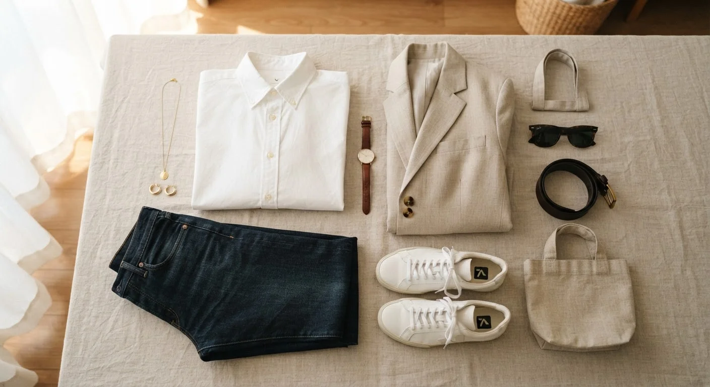
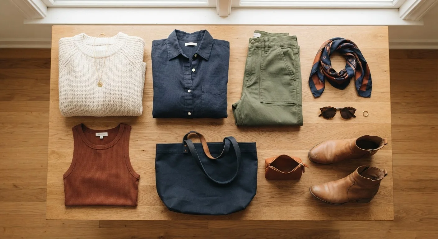
Neutrals are the easiest colors to coordinate because they pair with almost everything. Common neutrals include white, cream, black, gray, navy, tan, camel, and olive. Pull out every item in these shades and set them aside — this is your foundation layer.
If most of your wardrobe already lives in this range, great. If you have very few neutrals, note the gaps — they're worth filling before adding more color. See our guide to building a versatile wardrobe for a practical approach to filling those gaps without overspending.
Pick one accent color to work with
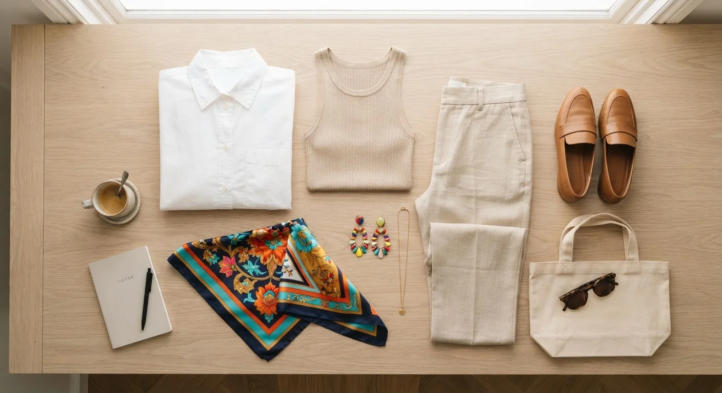
An accent color is any non-neutral that you repeat across one outfit — think a rust-orange scarf, burgundy shoes, or a cobalt blue shirt. The key is choosing just one per outfit rather than stacking multiple competing shades.
Look at the non-neutral pieces you already own and identify which ones you reach for most. That's likely your natural accent color preference — a useful piece of self-knowledge. Pairing a single accent with two or three neutrals is one of the most reliable formulas in everyday dressing.
Match tones, not just colors
Tone refers to how light or dark a color is, and how warm or cool its undertone is. Outfits where all pieces share a similar tone level tend to look cohesive even if the individual colors are different. Light with light, dark with dark, warm with warm — these pairings work almost automatically.
A common mistake is mixing a very warm piece (like a caramel-toned brown) with a very cool one (like an icy lavender) without a bridging neutral. The result can feel disjointed. If two items don't seem to want to sit together, check their undertones before assuming the colors are the problem.
Use the 3-color guideline as a starting point
A widely used rule of thumb in styling is to limit outfits to three colors or fewer — including neutrals. This isn't a hard law, but it's a reliable guardrail when you're still building confidence. Count your shoes and accessories; they contribute color too.
For example: cream trousers (neutral 1) + a navy linen shirt (neutral 2) + terracotta loafers (accent) is a clean, cohesive three-color outfit. Adding a patterned green jacket on top would introduce a fourth color and risk visual noise. For more on balancing basics with bolder pieces, see our article on neutral vs. statement pieces.
Test combinations with what you already own
Before drawing conclusions about what you need to buy, spend 15 minutes pulling different combinations from your existing closet. Many people discover workable pairings they'd never considered simply by placing items next to each other in good light.
This is also a great way to spot true gaps — pieces you own that don't coordinate with anything else. Our guide to shopping your own closet covers this process in depth and often surfaces far more outfit combinations than expected.
Your Phone Camera Is a Useful Tool
Before leaving the house, snap a quick photo of your outfit in natural light. Colors that look fine in a dim closet sometimes read differently on camera — a quick glance at the photo can reveal clashes or confirm the look is working. It takes five seconds and saves second-guessing later.
Once you've worked through these steps a few times, you'll likely find that coordination decisions happen faster and with far less second-guessing. The wardrobe staples guide can also help you identify which foundational pieces make coordination naturally easier over time.
Avoid Overloading on 'Rules'
Absorbing too many color guidelines at once leads to analysis paralysis — the very thing this guide aims to prevent. Start with just one or two principles and build from there. Wearing something confidently will always look better than a technically perfect outfit you're unsure about.